Skip to content

Recent Posts

  • Classic Fruit Slots and the Symbols That Never Get Old
  • RTP Configuration: Why the Same Slot Can Have Different Returns
  • NetEnt Slots Guide: Classic Mechanics and New Ideas
  • Slot Provider Trustworthy Checklist: What Should You Verify?
  • Compare Two Online Slots with a Simple Scoring Framework

Most Used Categories

  • Jackpot Slots (4)
  • Slot Guides (4)
  • Free Slots (3)
  • Mobile Slots (3)
  • Megaways Slots (3)
  • Slot Providers (2)
  • Slot Features (2)
  • Slot Reviews (2)
  • High-RTP Slots (2)
  • Slot Themes (1)
Skip to content
YukonBlondeStream.com

YukonBlondeStream.com

Subscribe
  • Free Slots
  • High-RTP
  • Jackpot Slots
  • Megaways Slots
  • Mobile Slots
  • Slot Guides

Home › Mobile Slots

Category: Mobile Slots

Modern Slot Game Mechanics: How Touch Interfaces Change Play

Modern Slot Game Mechanics: How Touch Interfaces Change Play

Javier Domínguez07/29/202608/13/2026

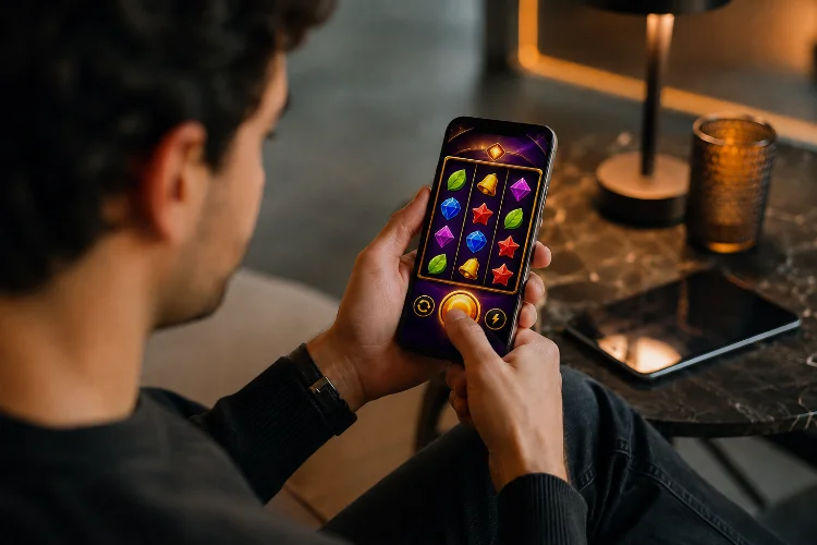
A slot designed around a mouse can technically run on a smartphone, but that does not mean it feels right. A cursor can accurately select a tiny icon, hover over controls, and move across a large screen. A finger is less precise, temporarily covers whatever it touches, and usually operates inside a much smaller display.

That difference has influenced Modern Slot Game Mechanics in ways that go beyond simply enlarging the Spin button. Touch-first interfaces affect how features are activated, how betting controls are organised, how bonus information appears, and how quickly the game responds to input.

Apple recommends designing games to embrace touchscreen interaction, while web standards provide dedicated pointer and touch technologies for handling fingers alongside mice and styluses.

Mobile design has therefore become part of the mechanic itself, not just the presentation layer.

Touchscreens Push Core Actions Toward Simple Taps

Desktop games can comfortably support small controls spread around the interface.

Touchscreens reward simpler interaction.

For slot design, that usually means important actions such as Spin, Bet, information, sound, and feature selection need obvious touch targets rather than controls that depend on precise cursor placement.

Apple recommends touch controls that are at least 44 by 44 points, while WCAG 2.2 sets a 24 by 24 CSS-pixel minimum target size for pointer inputs in applicable web accessibility scenarios.

That physical requirement can influence the entire control layout.

A large Spin button occupies considerably more screen space than a small desktop button. Bet adjustment may therefore move into a separate panel, while secondary settings are grouped behind a menu.

The mechanic remains the same mathematically, but its interation pattern changes.

Gesture Input Can Become Part of Feature Design

Touchscreens provide something a traditional mouse interface does not naturally emphasise: gestures.

Developers can detect taps, swipes, multiple simultaneous touch points, and more complex actions through technologies such as Pointer Events. MDN describes Pointer Events as a device-independent input model that can support mouse, stylus, and touchscreen interaction, including multiple active pointers.

That creates opportunities for game mechanics.

A bonus feature might allow the player to tap one of several mystery objects. Another could let users swipe between feature options or tap positions on a prize wheel.

However, gestures should add convenience rather than become unnecessary obstacles.

W3C accessibility guidance says functionality that relies on dragging should generally provide a single-pointer alternative when dragging is not essential.

So if a player can drag a slider to select a stake, allowing taps on the slider or separate plus-and-minus controls can make the mechanic easier to operate.

Screen Size Changes How Features Are Revealed

Desktop slot interfaces can display a lot at once.

A large monitor might show the reels, paytable shortcut, current bet, balance, autoplay settings, jackpot information, and several feature meters simultaneously.

A smartphone cannot comfortably give everything equal priority.

Touch-first design therefore encourages progressive disclosure: show the controls needed now, then reveal secondary options when requested.

For example, a feature-buy or bonus-selection interface may open as a full-screen layer rather than squeezing five choices underneath the reels.

This can change how a mechanic is experienced.

Instead of reading several options while continuing to watch the grid, the player enters a clearly defined decision state.

The underlying probabilities do not have to change. The responsivness of the interface simply makes the state transition more obvious.

Thumb Reach Influences Control Hierarchy

Most smartphone interaction happens with fingers approaching the display from below or from one side.

That gives certain screen regions more practical importance than others.

Game designers therefore tend to keep frequently used controls accessible while moving less frequent settings away from the central interaction area.

The Spin button is an obvious example.

If it were placed as a tiny control in a top corner, repeatedly activating it could be uncomfortable. A larger lower-screen control is easier to reach while leaving the reel area visible.

Apple’s broader game-design guidance encourages touch controls that work naturally with touchscreen interaction rather than merely reproducing controls designed for another input device.

This hierarchy can also affect mechanics such as turbo modes, bet selection, and feature choices.

Actions requiring repeated input benefit most from highly accessible positioning.

Immediate Feedback Becomes Part of the Mechanic

With a mouse, users can often see hover states before clicking.

A touchscreen normally has no persistent hover cursor.

The interface therefore needs to confirm input immediately after the finger touches the screen.

A button may depress visually, animate, vibrate where supported, or change state before the larger game animation begins.

This feedback is especially important in slot interfaces because an unclear tap can lead players to touch the control again. If the first tap was already registered, an accidental second interaction may follow.

Browser-based games can handle pointer-down and pointer-up states directly through Pointer Events, allowing interfaces to respond throughout the touch lifecycle.

The result is a subtle change in mechanic design: acknowledgement becomes part of the action itself.

A spin should not merely start. The interface should make it obvious that the request has been received.

Animation Timing Must Keep Up With Input

Touch design also exposes latency quickly.

When users directly touch a screen element, they expect it to react almost immediately. A noticeable delay between tapping Spin and seeing visual feedback can make the interface feel disconnected.

For browser games, requestAnimationFrame() allows animation updates to be coordinated with browser repaint cycles and generally follows the display refresh rate. MDN notes that common screens may operate at 60Hz while higher-refresh displays such as 120Hz are also widespread.

Modern slot interfaces therefore need animation systems that respond smoothly across different refresh rates.

That includes reel acceleration, button feedback, expanding symbols, counters, and bonus transitions.

The goal is not simply maximum frame rate.

Consistent timing makes touch interaction feel direct. Poor timing makes the player feel as though the interface is reacting after their finger rather than with it.

Touch Can Simplify Complex Bonus Mechanics

One interesting effect of mobile design is that complicated mechanics often need simpler interaction.

Imagine a bonus containing six upgrade paths and multiple configuration options.

On desktop, all six might appear simultaneously with descriptions beside them.

On mobile, that can become visually crowded.

A touch-first version might present large selectable cards, allow one tap to open more information, and use another clear button to confirm the choice.

This does not reduce the mathematical complexity of the bonus.

It reduces the interaction complexity.

Unity supports touchscreen input as a dedicated input source on mobile devices, and its current Web documentation also recognises touchscreen input among supported web input types.

Designers can therefore build mechanics around direct selection rather than treating touch as a simulated mouse click.

That distinction often makes mobile bonus systems feel more natural.

Accessibility Changes Good Touch Mechanics for Everyone

Touch design is also closely connected to accessibility.

Small adjacent controls can be difficult for anyone to activate accurately, especially on a moving device. The challenge is greater for users with motor impairments or reduced dexterity.

W3C notes that a finger is larger and less precise than a mouse pointer and provides target-size requirements and guidance intended to reduce accidental activation.

For slot interfaces, this supports several practical choices: larger controls, greater spacing, clear confirmation states, and alternatives to complicated gestures.

A swipe-only feature, for instance, may benefit from visible buttons that perform the same action.

This improves accesibility, but it can also improve the experience for everyone using the game one-handed, on a small screen, or while the device is moving.

Good touch mechanics usually reduce friction rather than add novelty for its own sake.

Touch Design Changes Interaction, Not Random Mathematics

There is an important boundary.

Moving the Spin button, increasing its size, or replacing a desktop menu with touch cards does not inherently alter RTP, symbol weighting, or RNG probabilities.

Those belong to the game’s mathematical model.

Touch interface design changes how players access and understand the mechanics.

A bonus wheel may be activated by tapping rather than clicking. A feature choice may use swipeable cards instead of desktop tabs. The result-selection mathematics can remain exactly the same.

This distinction matters because visually dramatic interaction should not be mistaken for greater control over random outcomes.

The user is controlling the interface.

The certified game logic still determines the result according to its underlying rules.

Modern Slot Game Mechanics increasingly reflect the realities of touchscreen play. Larger targets, direct taps, simpler feature selection, fast feedback, gesture alternatives, and mobile layouts all change how mechanics are experienced without necessarily changing their mathematics.

When evaluating mobile slot design, look beyond responsive graphics and ask whether every feature actually feels natural under a finger. That is where effective touch-first design becomes visible.

Need an App to Play Mobile Slots? Browser Gaming Explained

Need an App to Play Mobile Slots? Browser Gaming Explained

Javier Domínguez07/26/202608/05/2026

Downloading an application is no longer the default requirement for every mobile game. Many online slots load directly inside a browser, giving users access to reels, paytables, sound, and bonus features without a traditional installation.

So, do you Need an App to Play Mobile Slots smoothly? Usually not. A responsive casino website can deliver a complete mobile experience when the game, browser, and phone are properly optimized.

Applications still have advantages, but browser technology has reduced the difference between the two formats. Understanding how mobile websites work can help you avoid unnecessary downloads and choose the most practical setup for your device.

How Browser Slots Load

When you open a mobile slot, the browser requests the game’s files from a remote server. These may include code, images, animation, sound, and account information.

The first visit may take a little longer while these resources are downloaded. Browsers can store commonly used files in a cache, helping later visits feel more responsive.

You still need an internet connection because balances, logins, and game activity normally communicate with remote systems.

Responsive Design Fits the Game to Your Screen

A mobile-friendly casino does not simply shrink a desktop page. Responsive design can rearrange menus, resize game panels, and adjust text according to the available screen.

The goal is to make websites work effectively across devices with different screen sizes, resolutions, input methods, and performance levels.

A good slot should not require constant zooming. Buttons should remain easy to tap, and important information such as the balance and stake should remain visible.

Progressive Web Apps Blur the Difference

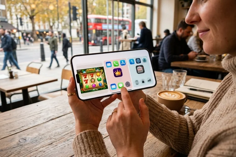
A progressive web app, or PWA, uses web technology while offering features commonly associated with installed applications. It can run as a normal website and may also be added to a device’s home screen.

On supported devices, an installed PWA can receive its own icon and appear beside traditional apps. When installation is not supported, the service can still work through the browser.

This makes PWAs a middle option between ordinary webpages and native casino applications.

Browser Play Saves Permanent Storage

A native casino app requires a dedicated download. Updates, cached graphics, and saved data may cause its storage use to increase over time.

A browser casino uses the browser that is already installed on your phone. It may store cookies and cached content, but it does not normally require another complete application.

This can be valuable on entry-level phones or devices already filled with photos, videos, and essential apps.

Performance Depends on More Than Format

A native app may launch quickly because its interface is stored locally. However, an optimized browser game can also perform smoothly on a modern phone.

Connection quality, available memory, browser version, graphics complexity, and background activity all influence performance. A lightweight three-reel slot may run better than an animation-heavy title regardless of whether it appears in an app or browser.

Close unnecessary applications and update your browser when games repeatedly freeze or respond slowly.

Browser Access Makes Comparison Easier

Using a browser allows you to visit several verified platforms without installing multiple applications. You can compare demo libraries, layouts, account tools, and game information in separate tabs.

This does not mean every accessible website is legitimate. Check the exact domain, licensing information, legal availability, and security details before entering personal or payment data.

A polished mobile design is not proof that a casino is authorized in your location.

What Changes with Real-Money Play?

A demo may use virtual credits and require no account. Real-money slots introduce registration, legal-age requirements, deposits, financial risk, and possible identity checks.

Licensed gambling apps distributed through Apple and Google stores must satisfy platform rules involving licensing and geographic restrictions.

Browser operators are not exempt from local gambling laws. Use only services legally permitted where you live, regardless of how you access them.

You rarely Need an App to Play Mobile Slots when a platform offers a well-designed browser casino.

Responsive websites can fit different screen sizes, while progressive web apps may provide home-screen access and app-like navigation without a conventional native download.

Browser play is especially useful for saving storage, exploring demos, and comparing platforms. An app may still provide faster access or stronger integration for regular users.

Open the verified mobile website first, test its speed and readability, and install software only when it adds genuine value. Keep your browser updated, avoid suspicious download prompts, and use clear financial and session limits.

Mobile Slots vs Desktop Slots: Speed, Screen, and Controls

Mobile Slots vs Desktop Slots: Speed, Screen, and Controls

Javier Domínguez07/22/202608/05/2026

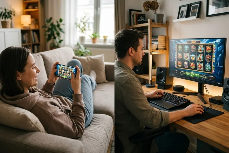
The same slot can feel surprisingly different when you move from a desktop monitor to a smartphone. Symbols become smaller, buttons change position, and features that filled one corner of a computer screen may be hidden inside a mobile menu.

Comparing Mobile Slots vs Desktop Slots therefore involves more than measuring screen size. You also need to consider loading speed, touch controls, graphics, audio, storage, and connection quality.

Modern games are often built to work across multiple devices, but good optimization is not guaranteed. Here is a closer look at the technical differences and how they influence the overall experience.

Responsive Design Connects Both Platforms

Many browser-based slots do not have completely separate mobile and desktop versions. Instead, one responsive interface adapts itself to the available screen.

CSS media queries can apply different layouts according to viewport size and can even identify environmental features such as touchscreen use. This allows a developer to move buttons, simplify menus, or change the reel dimensions for smaller screens.

A responsive game should remain readable without constant zooming or horizontal scrolling.

Desktop Screens Display More Information

A desktop layout can show the reels, stake controls, balance, paytable access, and promotional menus at the same time. This reduces the need to open and close panels repeatedly.

Large screens are especially helpful for slots with six reels, expanding grids, collection meters, or complicated bonus systems. The additional space does not change the mechanics, but it can make them easier to understand.

A desktop also supports several browser windows, allowing you to review operator rules or game information separately.

Mobile Controls Are Faster but Less Precise

A phone lets you tap directly on the interface. There is no cursor to move, so basic actions can feel immediate.

However, touch buttons need sufficient spacing. Accidentally tapping the stake selector instead of the paytable can be frustrating, particularly on compact screens.

MDN recommends designing mobile controls for touchscreen use while also supporting mouse and keyboard interaction on desktops and laptops. A game that ignores this principle may technically load on mobile without being comfortable to use.

Portrait or Landscape?

Portrait mode is natural for one-handed use and may suit simple slot layouts. Landscape mode gives the reels more horizontal space and often makes small symbols easier to see.

The better orientation depends on how the developer arranged the controls. Try both before deciding that the game is poorly optimized.

Desktop Hardware May Handle Heavy Graphics Better

Desktop computers often have more available memory, larger cooling systems, and stronger processors than budget smartphones. These advantages can help with animation-heavy games.

Nevertheless, software optimization remains important. A badly designed webpage can perform poorly even on powerful hardware.

Web games can use technologies such as Canvas, JavaScript, browser audio, and hardware-accelerated WebGL graphics. Performance ultimately depends on how efficiently those features are implemented.

Mobile Play Uses Battery and Data

A phone must power its screen, network connection, audio, and game animation from a limited battery. High brightness and detailed graphics can increase energy use.

Mobile data consumption also matters when Wi-Fi is unavailable. Responsive development can reduce unnecessary downloads by serving images suited to smaller displays instead of sending large desktop assets.

For smoother play, use a stable connection, reduce screen brightness, and close resource-heavy background apps.

Audio Can Behave Differently

Desktop browsers usually provide straightforward speaker or headphone controls. Mobile browsers may pause sound when the screen locks, another app opens, or an incoming call interrupts the session.

Browser audio behaviour can vary across platforms, so developers must decide which sounds are essential and provide suitable fallbacks.

Sound does not affect the outcome. Muting it can make mobile play more comfortable in public and reduce distraction.

Security Depends on the Platform Source

A desktop browser can reach fake websites, while a phone can install an unofficial or harmful application. Neither platform is automatically secure.

Check the domain carefully and use only legal, licensed services. Real-money gambling apps on Google Play must complete an approval process and provide a valid operating licence for each permitted market.

Avoid apps or websites requesting unrelated permissions, plug-ins, or unknown configuration files.

Does Either Device Offer Better Odds?

No device can turn random slots into predictable games. Regulated RNG results must be acceptably random and distributed according to the expected probabilities.

A phone, laptop, or desktop merely sends your action to the game system and displays the returned result. Changing devices is not a strategy for improving payouts.

Technically, Mobile Slots vs Desktop Slots is a comparison between flexibility and space. Mobile devices provide direct touch input and portable access, while desktops offer larger layouts, easier multitasking, and potentially stronger hardware.

A responsive, well-optimized game can work smoothly on either platform. Test loading speed, button size, orientation, and readability before beginning a longer session.

Keep your software updated, avoid unofficial apps, and use a stable connection. Most importantly, choose the device that helps you stay comfortable and aware of your activity-not the one you believe will produce better random results.

Spotlight

  • Progressive Jackpot Systems: How Seed Values Shape Every ResetProgressive Jackpot Systems: How Seed Values Shape Every Reset
  • Demo Slots vs Real-Money Slots: Which Mathematics Should Match?Demo Slots vs Real-Money Slots: Which Mathematics Should Match?
  • When Can You Win Real Money from Free Slots? Key ExceptionsWhen Can You Win Real Money from Free Slots? Key Exceptions
  • Why Free Demo Slots Work Like Real Online Slot GamesWhy Free Demo Slots Work Like Real Online Slot Games
Explore the technologies shaping modern life through clear, engaging coverage of gadgets, software, artificial intelligence, cybersecurity, mobile devices, apps, and digital innovation. Our technology content explains important developments, examines emerging trends, and provides practical insights that help readers better understand the tools, platforms, and ideas transforming the digital world today.
Find What You Need
See What’s Available
Check What’s Available
Explore What’s Available
Discover What’s Available
See How It Works
Learn How It Works
Discover How It Works
Find Out How
See How
Learn More About It
Find Out More About It
Discover More About It
Explore More About It
Read More About It
Get the Details
Get Full Details
Get the Full Story
View the Full Story
Discover the Full Story
Explore the Full Story
Find the Full Story
Learn More Now
Find Out Now
Read More Now
View More Now
See More Now
Get Started Now
Start Exploring
Start Discovering
Start Learning
Explore Here
Discover Here
Read It Here
See It Here
View It Here
Check It Here
Find It Here
Go Here
Visit Here
Click to Explore
Click to Discover
Click to Read More
Click to View
Click to See More
Click for Details
Click for More Information
Tap to Learn More
Tap to Explore
Tap to Discover
Take Me There
Show Me More
Tell Me More
Show Me the Details
See the Benefits
Discover the Benefits
Explore the Benefits
Find Out Why
See Why
Discover Why

Latest Updates

  • Classic Fruit Slots and the Symbols That Never Get OldClassic Fruit Slots and the Symbols That Never Get Old
  • RTP Configuration: Why the Same Slot Can Have Different ReturnsRTP Configuration: Why the Same Slot Can Have Different Returns
  • NetEnt Slots Guide: Classic Mechanics and New IdeasNetEnt Slots Guide: Classic Mechanics and New Ideas
  • Slot Provider Trustworthy Checklist: What Should You Verify?Slot Provider Trustworthy Checklist: What Should You Verify?
  • About Us
  • Contact
  • Disclaimer
  • Privacy Policy
  • Terms & Conditions
© 2026 YukonBlondeStream.com | Theme: BlockWP by Candid Themes.